Living Coral
At the beginning of the year, Pantone announced their choice for 2019’s Color of the Year: Living Coral. A “coral hue with a golden undertone,” the color was chosen after a nine month process where the Pantone team looked at trend-setting industries around the world, gathering examples of colors or “proof points” from fashion runways, car shows, sporting events, social media, beauty, new technologies, and visual arts. In a process that’s more intuition than science, the colors were narrowed down until one stood out.
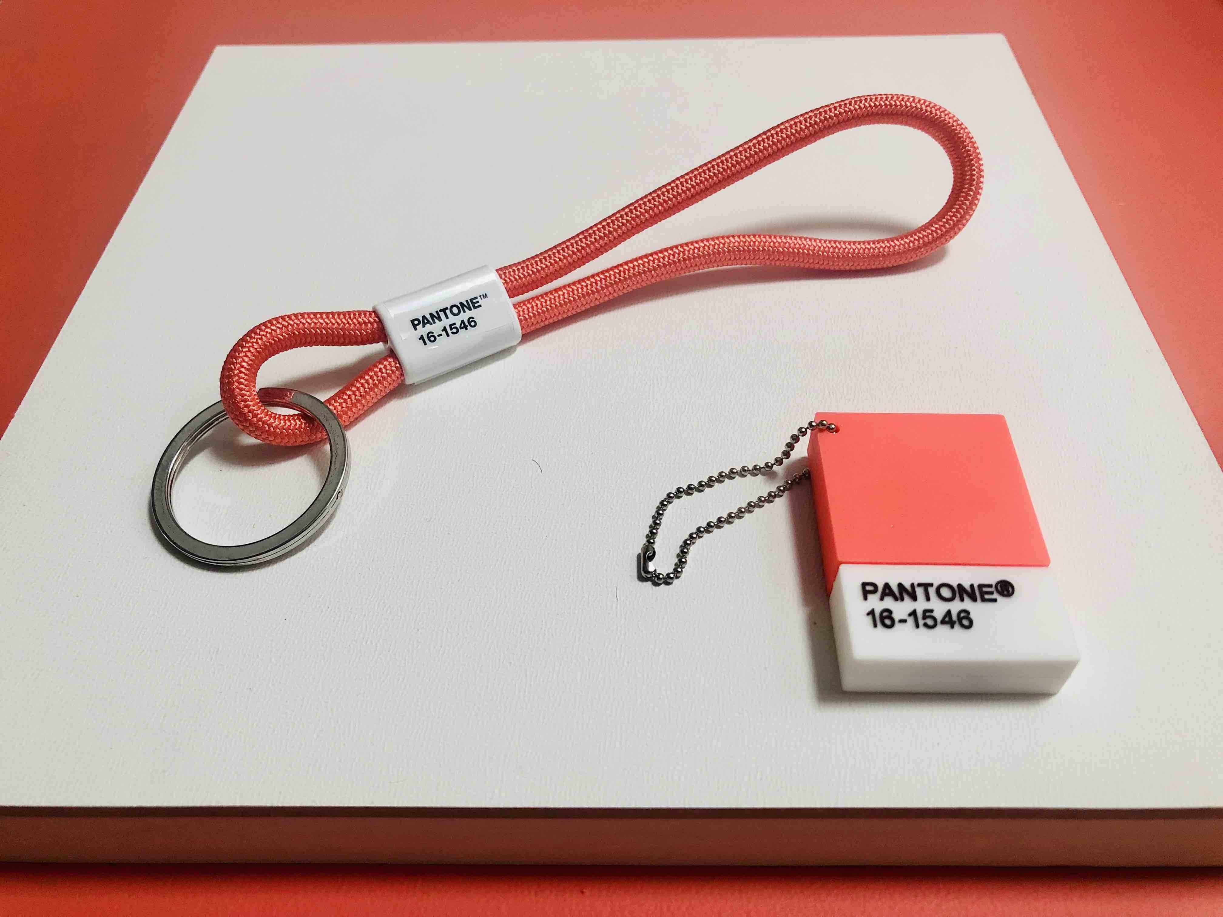
Pantone key chain $8, USB flash drive $15
pantone.com
“With everything that’s going on today, we’re looking for those humanizing qualities because we’re seeing online life dehumanizing a lot of things,” Laurie Pressman, Pantone’s vice president, told The Associated Press. “We’re looking toward those colors that bring nourishment and the comfort and familiarity that make us feel good. It’s not too heavy. We want to play. We want to be uplifted.”
The announcement came at a time when we’re surrounded by stories of plastic drowning our oceans and our sunscreen bleaching the very “living coral” that‘s being celebrated. It’s a strange juxtaposition: the desire for a cheerful, optimistic color that also brings attention to what we’re losing in real time.
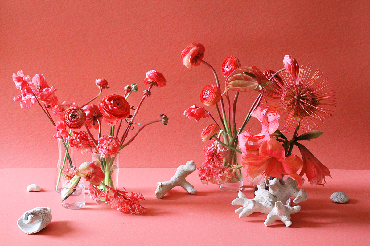
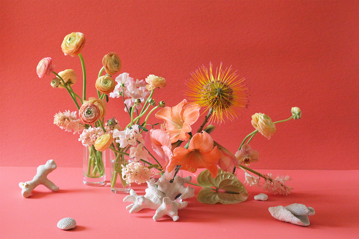
Floral installation by Krystal Chang
But living in these times is a constant reconciliation of opposites – trying to find connection IRL while existing in a digital world, going about our daily lives while knowing about climate change. But perhaps this color is a reminder of what keeps us going – the happy moments, the pops of joy, tempered by a communal responsibility for making sure the future remains as bright.
But perhaps this color is a reminder of what keeps us going – the happy moments, the pops of joy, tempered by a communal responsibility for making sure the future remains as bright.
Written by Krystal Chang
